Visualizing Map Service Usage
I recently developed a JavaScript web application to visualize incident reporting for a local municipality collecting Stormwater Incident Reports.
The idea behind this application, will be to determine the usage of the reporting system, and to additionally determine “Problem Areas” for further corrective action planning.
Importance of Dynamic Display
One of the most important considerations for determining areas, is to determine the scale. The scale the data is viewed at can change the data is interpreted.
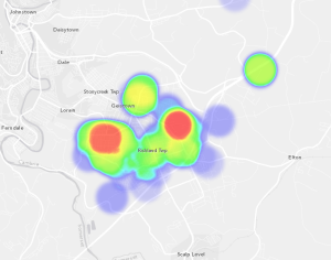
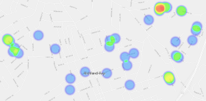
Small scale cannot accurately depict areas.
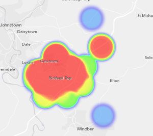
Large scale does not allow for a focused approach to specific areas.
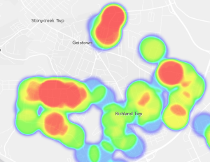
Just right. This scale provides a few areas that are easily identifiable.
Errors
Be mindful of particular input errors. These include multiple responses from a single resident, which can skew how the data is depicted.
How can I make this?
The ArcGIS Solutions are full of templates that can be modified for your use. I prefer to check out their GitHub account for all the latest templates.